
Website Design for Therapists & Psychodynamic Psychotherapists: What Actually Matters

Why therapist websites need a different approach
A website for a psychodynamic psychotherapist has a slightly unusual job to do.
It is not just there to explain who you are and what you offer. Of course it needs to do that. But really, its first job is to help someone feel they have landed in the right place. Or at least a place that feels calm enough to stay for a moment.
That matters because people do not usually arrive on a therapist’s website in the same frame of mind they might arrive on the website of an accountant, a florist, or a local tradesperson.
They may be anxious. They may be emotionally tired. They may have put off looking for support for weeks, perhaps longer. Some will know exactly what they are looking for. Quite a few will not.
They will simply know that something feels difficult, and they are trying to work out what to do next.
So the website ends up carrying a bit more emotional weight than most.
It needs to feel clear, but not clinical. Warm, but not overfamiliar. Professional, yes, but not cold.
That balance is harder to get right than it sounds. We have seen therapist websites that drift too far one way or the other. Some are so sparse and abstract that a visitor is left unsure what is actually being offered.
Others try too hard to reassure and slip into generic marketing language. Neither feels especially grounding.
Psychodynamic psychotherapy brings its own tone as well. People looking for this kind of work are often looking for depth, thoughtfulness and a sense of seriousness. Not heaviness exactly, but substance.
They are not usually looking for quick fixes, and the website should not accidentally sound as though it is selling one. This is where design starts to matter in a very practical way.
The choice of words. The spacing. The page structure. The way information is revealed. Even the general pace of the site.
A good therapy website does not need to be flashy. In most cases, it probably should not be.
It needs to help a visitor understand who the therapist is, what kind of support is offered, how sessions work, and what the next step looks like. Quietly. Clearly. Without making that person work too hard.
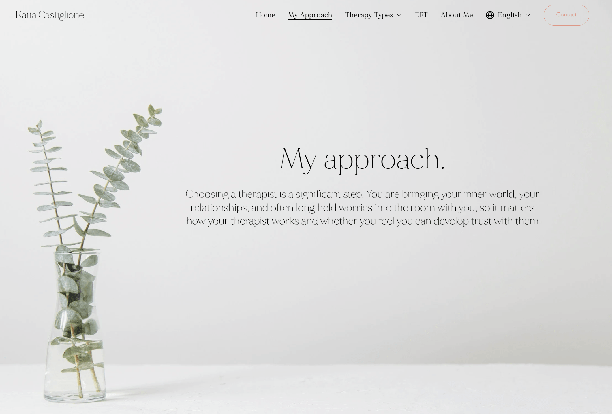
On a recent website project for a psychodynamic psychotherapist, our aim was not to make the site look clever. It was to make it feel steady, trustworthy and easy to move through.
Clear service pathways, simple navigation, a gentle visual tone, qualifications in the right place, and a contact route that did not feel abrupt. Nothing dramatic. But often that is exactly the point.
What potential clients are actually looking for
When someone lands on a therapist’s website, they are not usually admiring the typography or noticing how clever the layout is. Not consciously, anyway.
What they are really doing is asking themselves a few questions.
Can I trust this person?
Do they seem calm and credible?
Do they understand the sort of thing I might be bringing?
And perhaps most importantly, what happens if I decide to get in touch?
A lot of therapy websites explain the practitioner well enough, but do not make the next step feel especially clear or manageable.
For somebody already feeling hesitant, even a small amount of friction can be enough to stop them there and then. They may mean to come back later, but often they do not.
So in practical terms, most potential clients are looking for reassurance in a few specific ways.
They want to know who the therapist is, what kind of therapy is offered, and whether it sounds relevant to their situation.
They want some sense of the therapist’s background, qualifications and professional memberships, but usually without having to dig too hard for it.
They want the tone of the site to feel measured and human. And they want the contact process to feel straightforward, not awkward, overly formal, or hidden away.
In our experience, clarity tends to beat cleverness every time here.
That does not mean everything has to be stripped back to the point of feeling empty. It just means the site should answer the obvious questions in the right order.
Who is this for.
What kind of support is available.
How does it work.
Where does it happen.
What does it cost.
How do I take the first step.
If those answers are scattered all over the place, or wrapped up in language that feels too vague, people can lose confidence quite quickly.
People are often judging the emotional tone of a therapist’s website long before they have properly read the words. The colours, spacing, imagery, pace of the page, and the amount of visual noise all contribute to that first impression.
A site can feel calm and containing, or slightly chaotic and hard work.
On a psychodynamic psychotherapy website we recently designed, the focus was very much on making those early questions easy to answer.
Clear pathways into individual and couples therapy, visible qualifications and memberships, a calm visual style, and a gentle explanation of the next step. Nothing overdone. Just enough to help a visitor feel oriented and, hopefully, a little less uncertain.
That, in the end, is what many therapy websites need to do.
Not sell aggressively. Not perform.
Just help the right person feel safe enough to continue.
What a good psychotherapist website should actually include
Once the tone is right, the structure has to do its job as well.
This is where quite a few websites come unstuck, really. Not because they are badly designed, but because they leave too much unsaid, or they make people hunt for basic information that ought to be obvious.
A visitor should not have to piece things together.
In our view, a good website for a psychodynamic psychotherapist usually needs a few core elements.
It needs a clear homepage that explains, fairly early on, who the therapist helps and what kind of support is available.
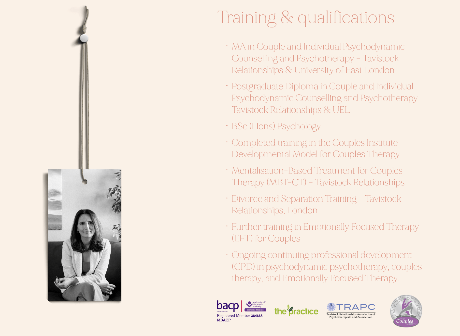
It needs an about page that gives a sense of the person behind the practice, their qualifications, their approach, and their professional standing.
It needs service pages that make it easy to understand the difference between, say, individual therapy and couples therapy, if both are offered.
And it needs practical information that people almost always want before getting in touch, such as location, online availability, fees, and the first-step process.
That may sound obvious, but it is surprising how often one or two of those pieces are missing.
Fees are a common one. Some therapists prefer not to publish them, which is of course their choice, but from a website point of view it can add uncertainty. Even a simple explanation of how fees are handled is often better than silence.
We also think a therapist website benefits from a gentle sense of progression. In other words, the site should move a visitor from general understanding to specific reassurance.
First, who is this person and what do they offer. Then, how do they work. Then, what happens if I get in touch. That order matters. Or at least it often does.
Professional memberships should be easy to find. So should qualifications.
The contact page should feel straightforward and not overly complicated. If there is a contact form, it should ask for what is needed, but no more than that.
On another recent psychodynamic psychotherapy site we designed, that structure was handled in a fairly simple way. The homepage introduced the practice calmly, the therapy routes were clearly separated, the credentials were visible, and the contact pathway felt natural rather than abrupt.
A recent example of this approach in practice
A recent website project we worked on for a psychodynamic psychotherapist brought all of this into focus quite nicely.
The aim was never to create something flashy or overly designed. In fact, that would probably have been the wrong direction altogether.
The real goal was to create a website that felt calm, credible and easy to move through, while still giving potential clients enough information to understand the therapist’s approach and decide whether to take the next step.
So the structure was kept deliberately clear.
The homepage introduces the practice in a measured, reassuring way.
The different therapy routes are easy to follow.
Qualifications and professional memberships are visible, but not pushed so hard that the site starts to feel defensive or formal.
And the route into making contact is straightforward. If someone has already built up the courage to look for support, the website should not then make that next step feel awkward.
We were also very conscious of tone throughout the site. Therapy websites need warmth, yes, but they also need boundaries. They need to feel human without becoming overly personal, and professional without becoming cold.
That balance runs through everything, really - the wording, the page layout, the amount of space, the pace at which information is revealed.
In this case, the final result is a website that does not try too hard. And that is probably one of the reasons it works. It feels thoughtful, steady and clear. For this kind of practice, those qualities matter far more than clever visual tricks or overblown messaging.
Thinking about a website for your therapy practice?

If you are a psychodynamic psychotherapist thinking about creating a new website, or replacing one that no longer feels quite right, it is worth remembering that a good site does not need to do anything flashy.
It needs to feel clear. Calm. Trustworthy. It needs to reflect the way you work and help potential clients understand, without too much effort, who you are, what you offer, and how to take that first step.
That may sound simple, but getting that balance right is often where the real work sits.
At Old Bear Studio, we build websites with that in mind. Thoughtful, well-structured sites that feel professional and human, and that are designed around the needs of the people actually using them.
For therapists, that means creating something that supports trust from the outset and makes the path to enquiry feel natural rather than uncomfortable.
If you are considering a new website for your practice, we would be very happy to have a conversation.